PROJECT ROLE
UI + UX Design, Visual Design, User Flow, Research, Prototyping + Testing
TOOLS
Figma, Zeplin, Jira, Microsoft Teams, Adobe After Effect
TEAM STRUCTURE
Project Manager, Business Analyst, UI/UX Designer, Quality Assurance, Developer
THE CHALLANGE
This project is focused on the internal tools for retail employees who lacked for recording offline purchases and tracking shipments. A major focus was resolving the operational bottlenecks that happen when the customers need to process exchanges, voids, and returns.
The development process is required to managing strict time-zone gaps with a limited communication(9–11 AM and 8–9 PM EST). This environment needs a high discipline and efficient 24-hour feedback loops.
OBJECTIVE/GOAL
To design a Mobile Point of Sale (mPOS) application that will be used by employees to manage purchase histories and real-time shipment tracking. The primary goal was to eliminate operational bottlenecks by creating an user friendly interface to handle complex exchanges, voids, and returns, ensuring a smooth experience for both staff and customers.
I conducted interviews with 5 employees regarding the current issues they face with returns, voids, exchanges, and shipping tracking.
Key Questions
What are the primary challenges currently faced by employees for in-store transactions?
Why is it difficult to give customers real-time updates on their shipments?
What makes the return, void or a product exchange task more stressful compared to a regular task?
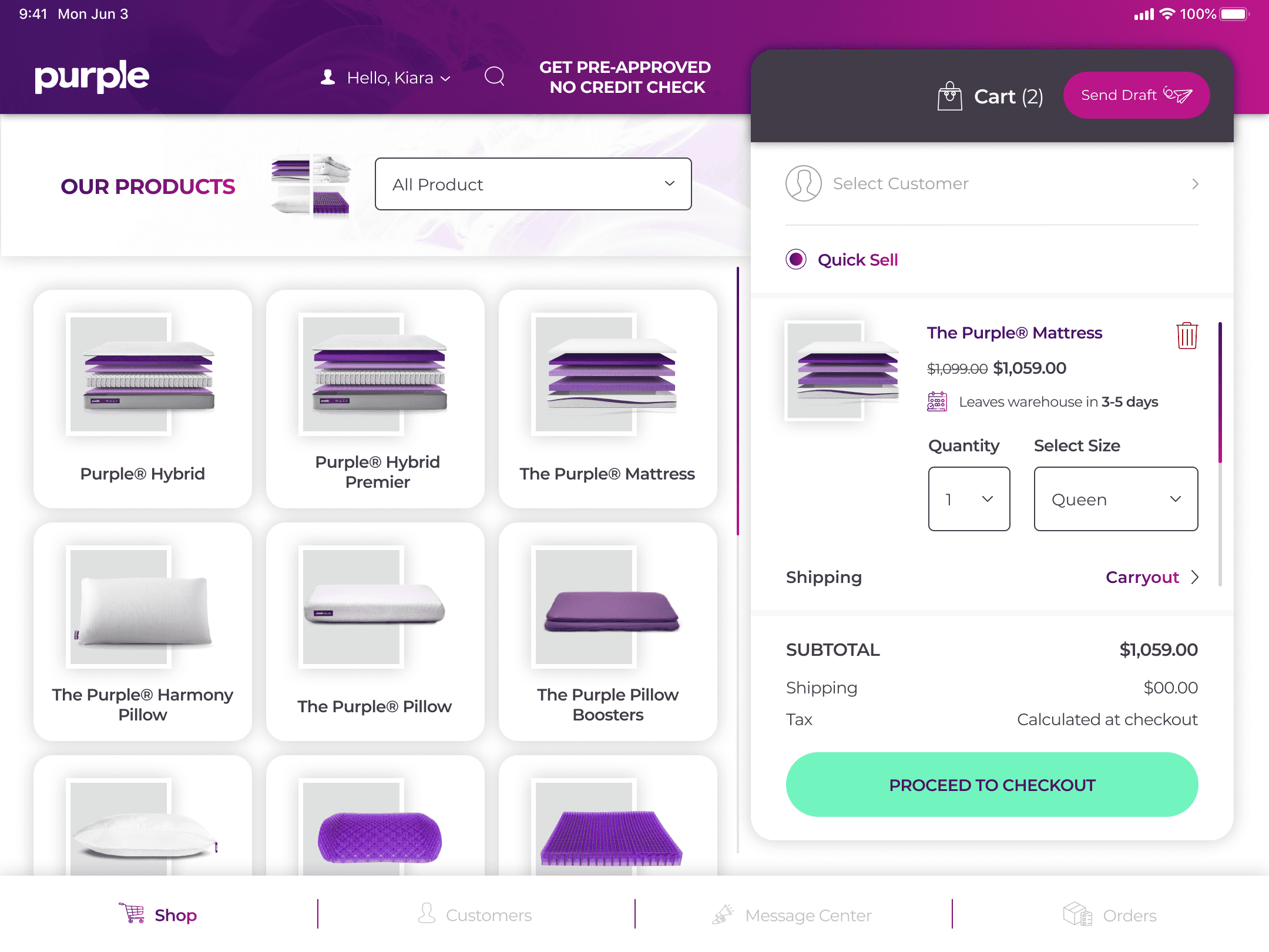
Purchases is far too slow because staff must check manually.
All 5 employees highlighted that the initial checkout process for offline purchases is far too slow. Because the system lacks automation, staff must manually check stock availability and hand-write or manually type shipping details.
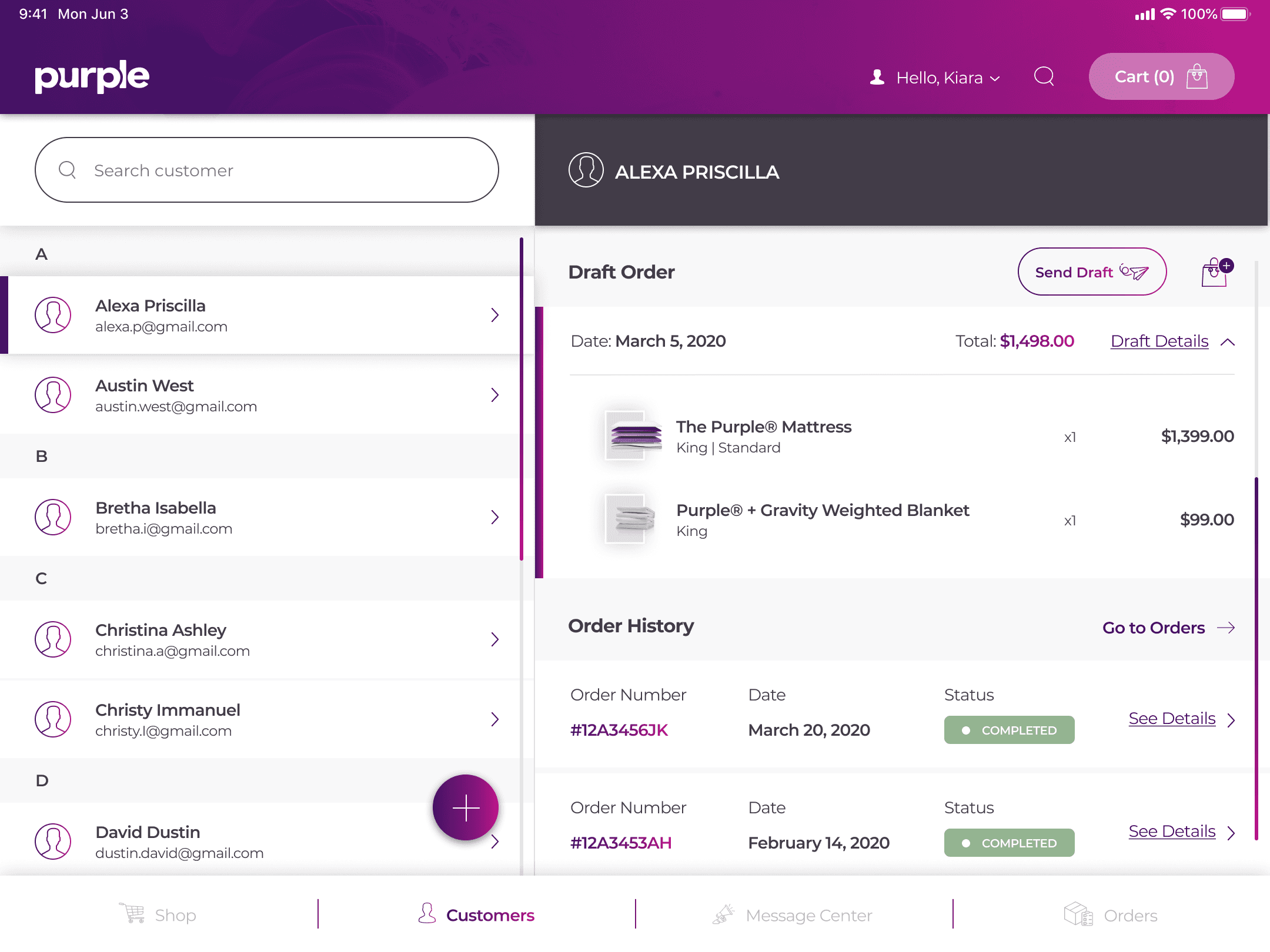
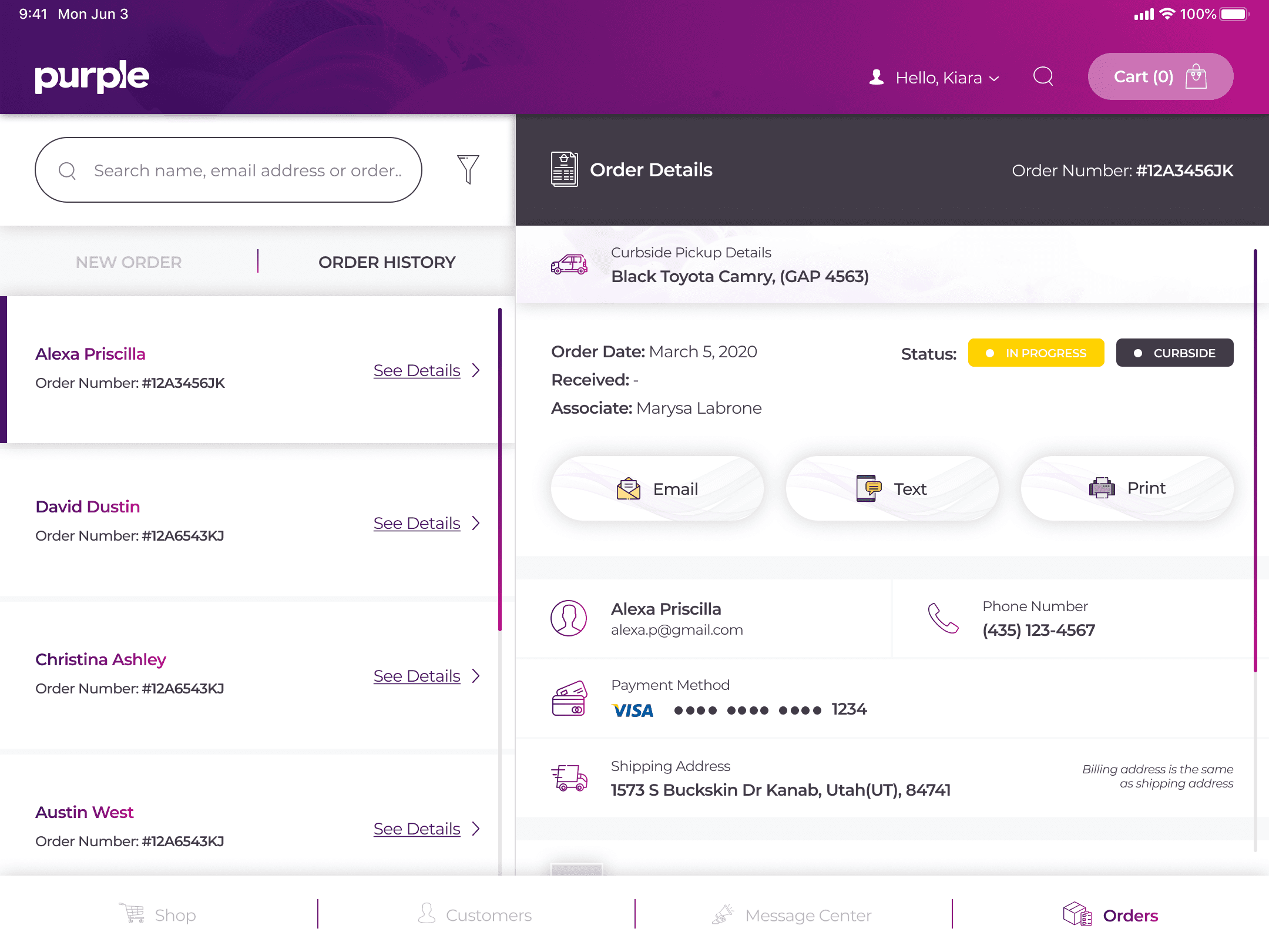
Frequently losing track of shipment can damages the brand's reliability.
Employees reported frequently losing track of shipment statuses because the records are fragmented. Without a centralized tool, they cannot give customers quick answers, which directly damages the brand's reliability.
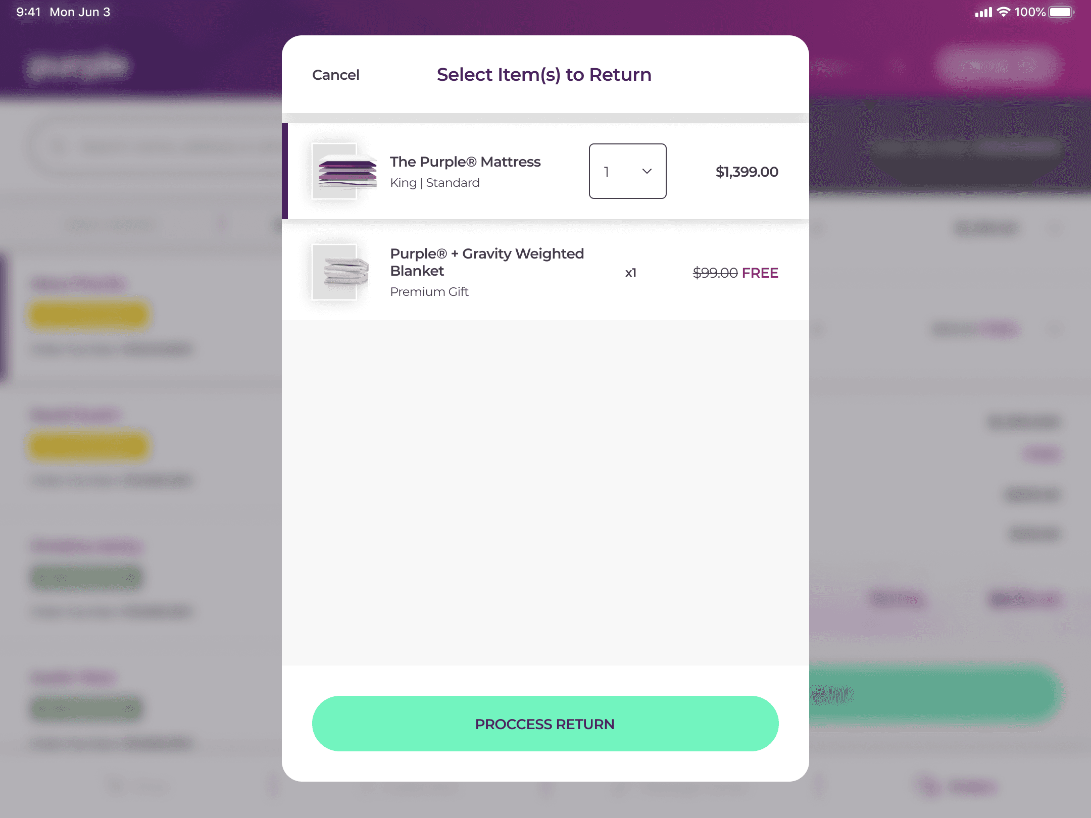
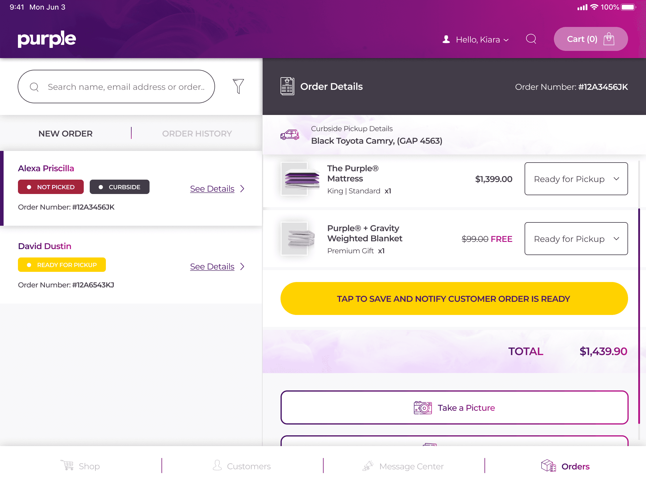
Return, void, and exchanges are the most stressful tasks.
Participants say that voids and exchanges are the most stressful tasks. They currently have to input the same data multiple times across disconnected systems. This thing turns a simple 2-minute exchange into a 15-minute one, which is causing long queues and high stress for the frontline staff.
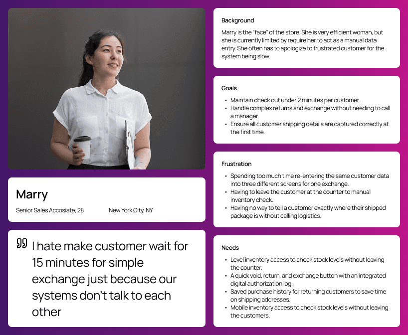
With insights gathered from the interviews, I developed personas to represent the primary user groups. These personas helped in understanding the unique qualities, preferences and behaviours of the employees.

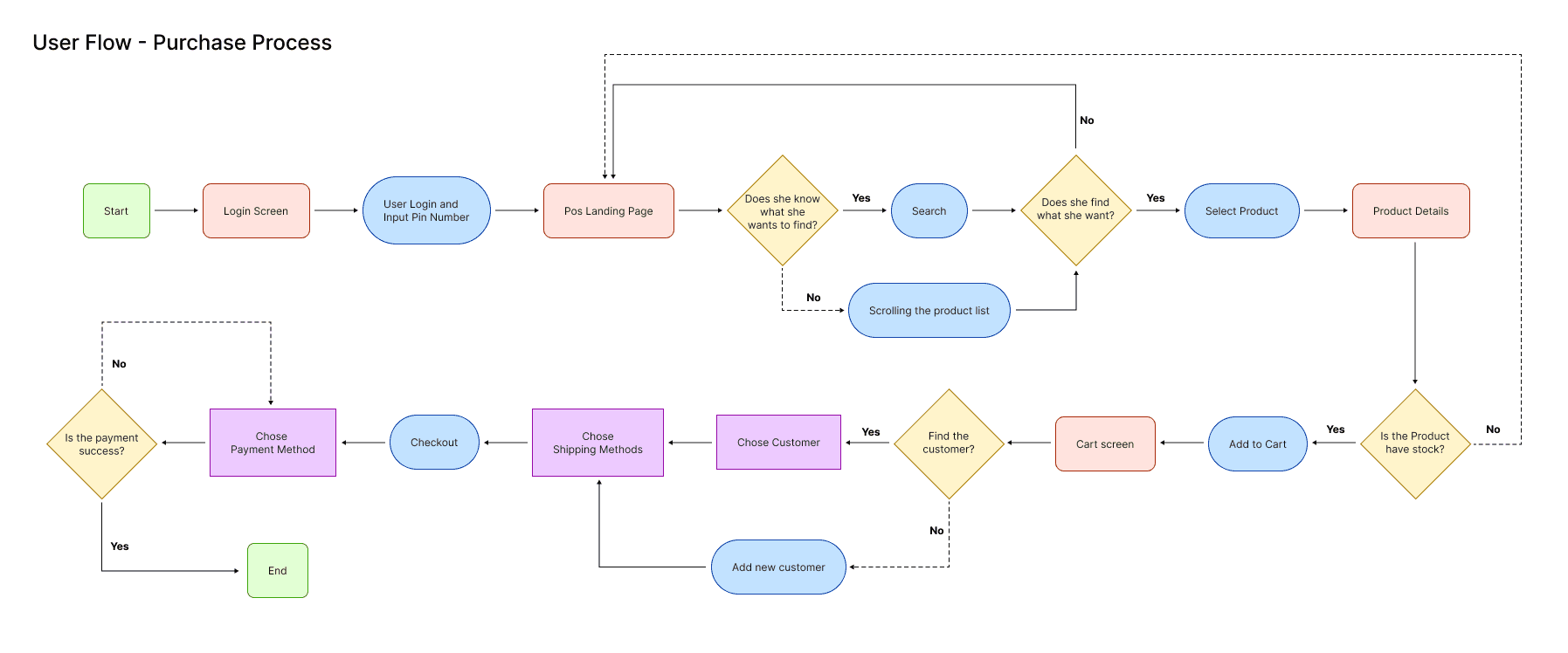
Then, I mapped out the user flow, focusing on the purchases process for new customers.

I started with low-fidelity wireframes to explore different layouts and navigation options. These wireframes focused on the happy flow for making purchase and return product.


Because the brand already have strong character with the purple themes, so I decided to using color from the website to align with brand identity. I wanted the design to be clean, user-friendly, and easy to navigate.
For the typography, I followed the official brand guidelines by using Montserrat. I also aligned the font weights and size scales with the existing website to meet the client's specific requests.
After finishing the branding, I create those concepts into high-fidelity mockup. Then I built a functional prototype to conduct usability testing, allowing me to gather direct feedback from employees and refine the transaction flow before development."
View Prototype